Light diffuser
Sunday 4 April 2021
3D
Each character of the name sign will get LEDs to light them up. By now, I know how to control the LEDs using a microcontroller. And I have a LED-matrix that I can use to figure out how much light is generated by the LEDs. It’s time to figure out how to diffuse the light and this is also a good moment to print out a character to see if the parts fit.
Testing time
The design of the name sign is based on two fonts that complement each other: Namskout and Namskin. Namskout will be used for the casing, which I want to print in black. And then Namskin will be used for the front of the characters. The fronts will be white, and I need to figure out how thick the front needs to be. It should be as thin as possible to make sure that the light of the LEDs passes through. But we shouldn’t see the individual LEDs through the front; the light needs to be diffused.
And the results are…
Theoretically, the casing and front should nicely fit. To make sure that the theory is correct, I want to print a character to make sure. I printed one set and made the front 1 mm thick.
The result was good; the two parts fit, and light is diffused by the front. However, I felt that there was a lot of light lost by this thick front. So, I did a few more and ended up with this set of options:
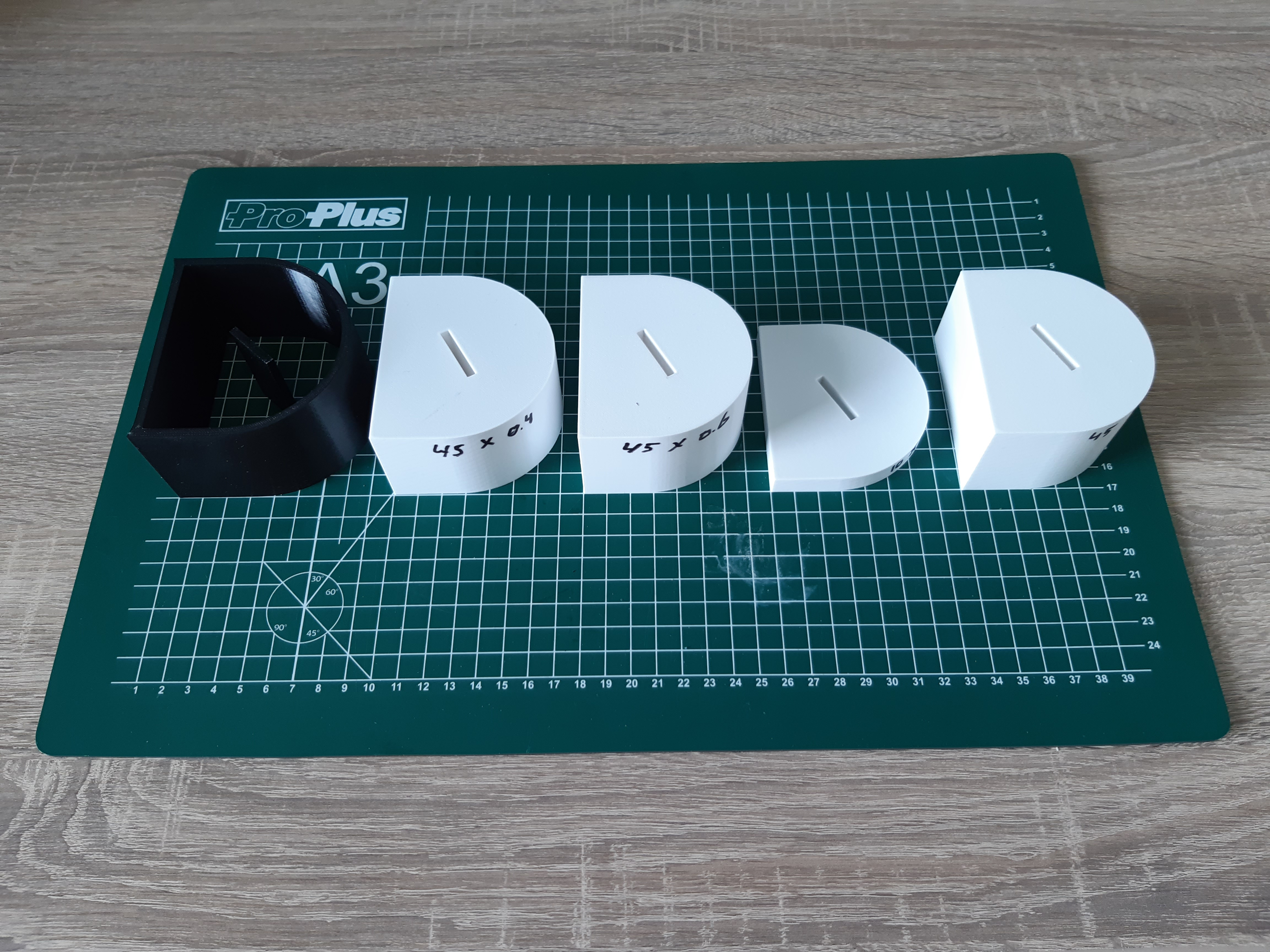
The thinnest one (0.4 mm) was not diffusing the light enough. The 0.6 mm was better, but I still didn’t like it. The 0.8 mm seemed to be the best option. Next to the thickness of the front, I also tested if the light would be different if I wouldn’t make the front the same height as the casing.
The result: the white of the inner part has quite some effect on the overall light through the front. So, the height of the inner part needs to be covering all the black of the casing.
Then I also had to find out which LED strip to use. I tested this using the LED matrix that I showed in the previous post.
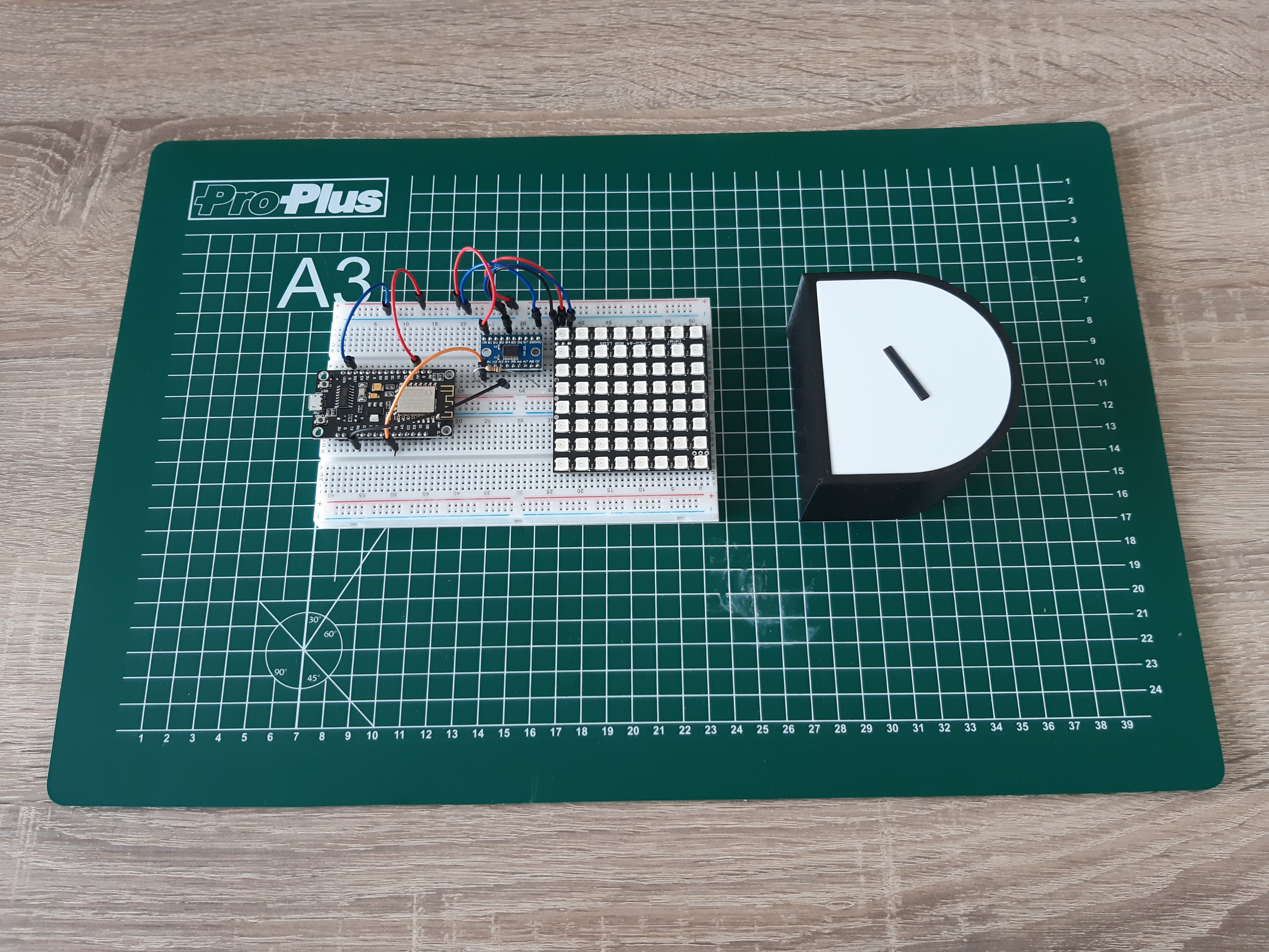
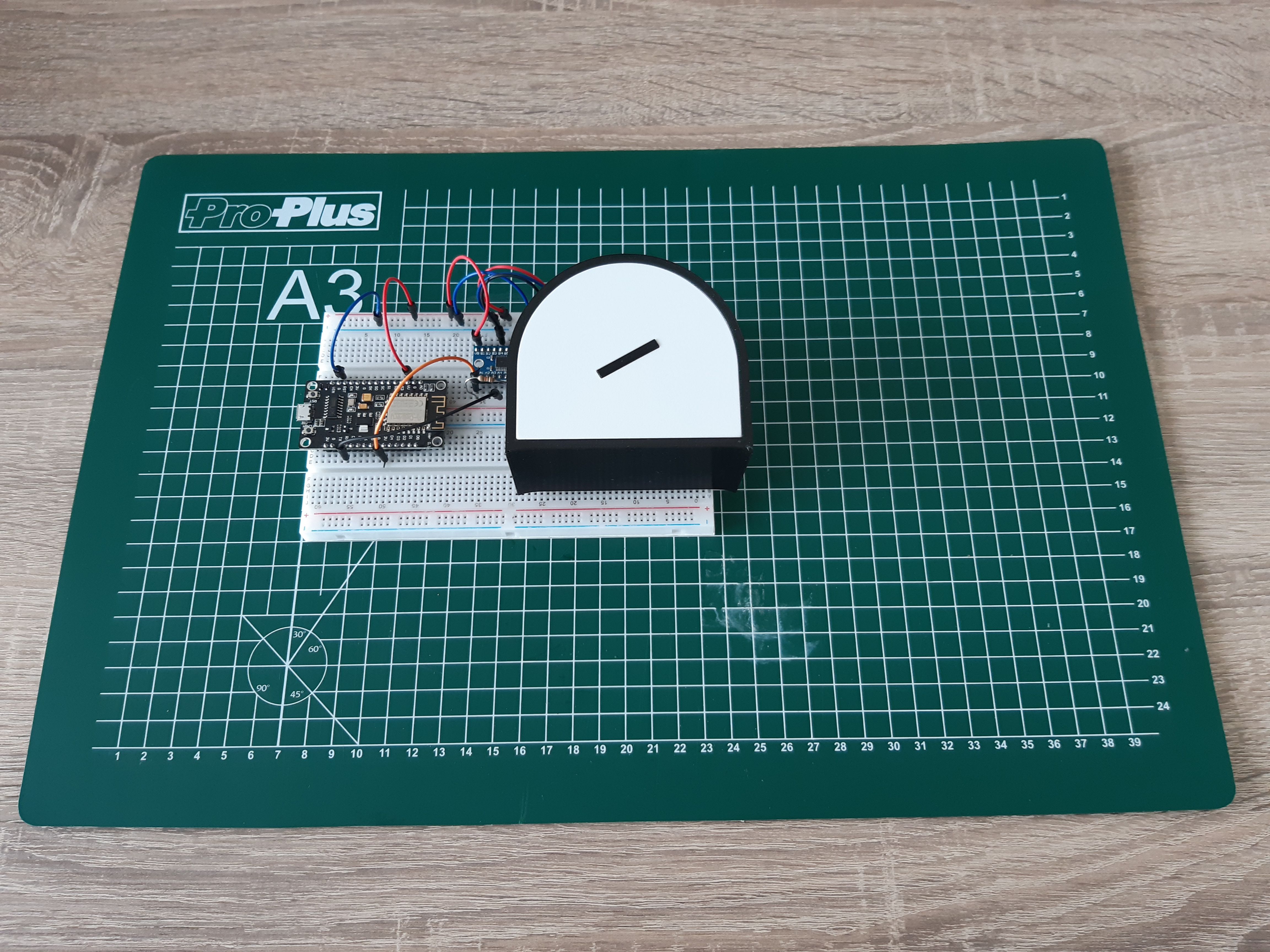
By turning individual LEDs on or off, I could emulate the different type of LED strips and see what the impact was. Next to the number of LEDs per meter, I also found out that the placement of the LEDs was important. With some of the characters, like the ‘D’ that I used for testing, there is a middle part that can produce shading effects.
Conclusions
The parts nicely fit; based on that, I am confident that I am on the right track regarding the design.
The fronts will be 0.8 mm thick and will cover the full inside of the casing to have the best result.
A strip with 60 LEDs per meter should be sufficient for the sign. Going higher would result in more light but would also consume far more power which has its own issues. More on that in a future post.
So, we are heading in the right direction. Next step is to finalize the design.
Want to respond to this post?
Look me up on GitHub,
 Facebook or
 LinkedIn.
Tags
- 3D 9
- Air Safari 19
- Australia 67
- BlackBerry 1
- Blue Sky Flying Adventures 33
- By Boat 4
- By Bus 2
- Dev Containers 3
- Domoticz 2
- Driving 31
- Facebook 1
- Flying 44
- Gallery 2 7
- Google Maps 4
- Hugo 1
- Jekyll 4
- Linux 3
- NextGEN Gallery 5
- Owning a plane 8
- Podman 3
- Red Centre Tour 19
- Singapore 3
- Tasmania 10
- USA 33
- WSL 2 4
- Walking 42
- WordPress 17