Designing the name sign
Saturday 13 March 2021
3D
The project has started! As stated in the previous post, I will use OpenSCAD to create my name sign. OpenSCAD is not a text editor and I have no clue if it can do anything with text and fonts. So, let’s dive into OpenSCAD.
I am not big fan of reading books and long instructions, but I also don’t want to waste my time to find that it was written down in line one of a manual. This learning track was a nice mix of reading, trying, failing, searching, trying, failing, searching and finally: success.
The whole name sign thing depends on the ability to use text in OpenSCAD.
I browsed the OpenSCAD website and found the Cheat Sheet; loved it.
And there it is: the text module and the documentation states:
“The text module creates text as a 2D geometric object, using fonts installed on the local system or provided as separate font file.”.
Exactly what I need; let’s try this.
Fonts…
Getting the text in a 2D or 3D format was no issue.
The main topic was: how to get the correct font?
I downloaded the Namskow font and installed it on my computer.
Created an OpenSCAD file and added a text with the font parameter; then did a linear_extrude to turn it into a 3D object and this was the result:

Conclusion: we are not there yet!
I tried several days and many ways to get this into a format that I could extrude. But there was just no way that this font would work. Eventually, I got back to the website of the designer of the font and found 2 more: Namskout and Namskin. Now things became more interesting.

That’s much better!
I put 2 characters on top of each other to make sure that the combination of Namskout and Namskin would fit. And they do. This means, that I can use the Namskout font for the outer part and Namskin for the inner part of an object.
Layout…
In the examples, all the characters are detached and that’s not what we want; we need to move them closer to turn this into a single name sign. The way I did so, was to move each individual character closer to the next one. Here’s the first attempt of that:
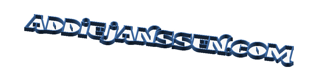
I played with upper- and lower-case characters and tried to move all characters so they would overlap. The result is a single object, but with issues. I don’t like the look of it yet, but that is just work. The bigger issue is size. When I scale this object to a 20 cm height, it would be over 270 cm wide. That is just ugly looking. The whole thing is just too wide to fit on a single line. We need to split it up in multiple lines.
This is the result after playing with multiple ideas and fumbling around with the upper- and lower-case characters and distances:

This is now just over 30 cm high and about 80 cm wide; a much nicer ratio, I think.
By splitting the text up in multiple lines, I have introduced a new problem. The sign will probably be placed on a shelve. But in its current format, it would need some kind of support to have it nicely stand on its own.
Introducing the electronics box…
Since I am going to add LEDs to the characters and a microcontroller to control them, I need a place to house the electronics. Let’s combine the 2 topics; create some kind of support that will house the electronics. Something like this:

That would solve the “standing up” issue, but it doesn’t look nice. This box needs changing. I liked the format of the “M” and thought: why not use that outline for the box?
How to turn the “M” into a nicer looking box?
I could not find a nice way of doing this with OpenSCAD. However, OpenSCAD can export and import SVG files. I used OpenSCAD to export the “M” to an SVG file. I then used Inkscape to edit that SVG file and remove the “v” shape at the top and the bottom of the character. Saved it to an SVG file again and imported that into OpenSCAD. The result looks like this:

Add that to the name sign and we get this:

That will do the trick.
Can we print this?
Nope… This thing is way too big for my printer. The printer can print objects up to 25 x 20 cm on the X- and Y-axis. The Z-component will probably not be an issue; I am aiming at 5 cm depth for the sign. The result: cut the sign up in sections that can be printed. I will come back to this topic in another post where I will show how I did that and what new problems I got into by doing so.
For now: I am happy with the design. Next step is to think about the actual construction. We need a front and a back. And we need to make sure that the front will allow the light of the LEDs to pass through. More about those topics in the next posts.
Want to respond to this post?
Look me up on GitHub,
 Facebook or
 LinkedIn.
Tags
- 3D 9
- Air Safari 19
- Australia 67
- BlackBerry 1
- Blue Sky Flying Adventures 33
- By Boat 4
- By Bus 2
- Dev Containers 3
- Domoticz 2
- Driving 31
- Facebook 1
- Flying 44
- Gallery 2 7
- Google Maps 4
- Hugo 1
- Jekyll 4
- Linux 3
- NextGEN Gallery 5
- Owning a plane 8
- Podman 3
- Red Centre Tour 19
- Singapore 3
- Tasmania 10
- USA 33
- WSL 2 4
- Walking 42
- WordPress 17